
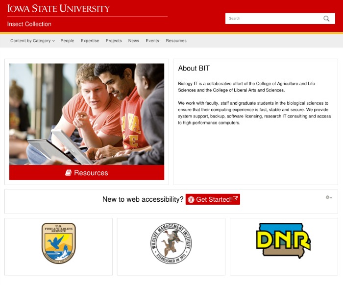
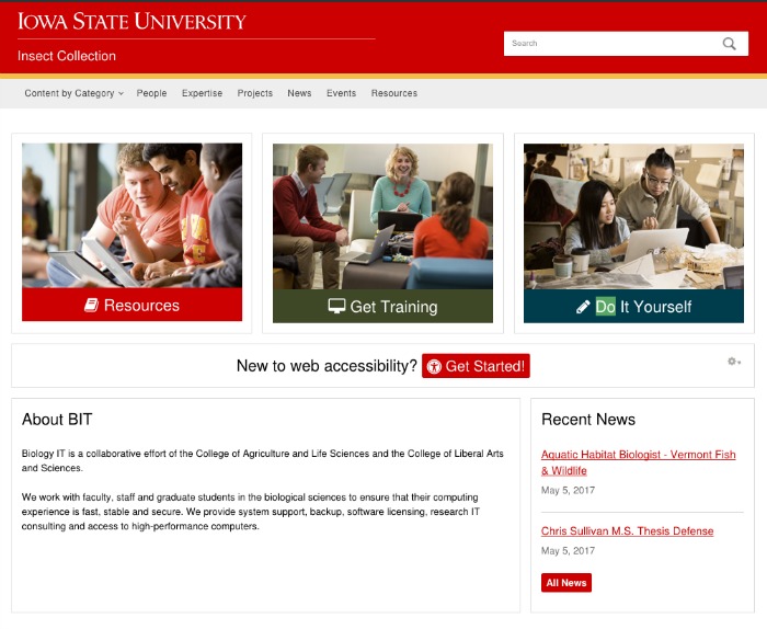
Example Suitcase Layouts
Suitcase has a flexible page layout grid so site administrators can use a drag-and-drop interface to create interesting homepage and landing page layouts. Layouts are mobile responsive.
Virtually any kind of Luggage content can be configured to work neatly in a panel.

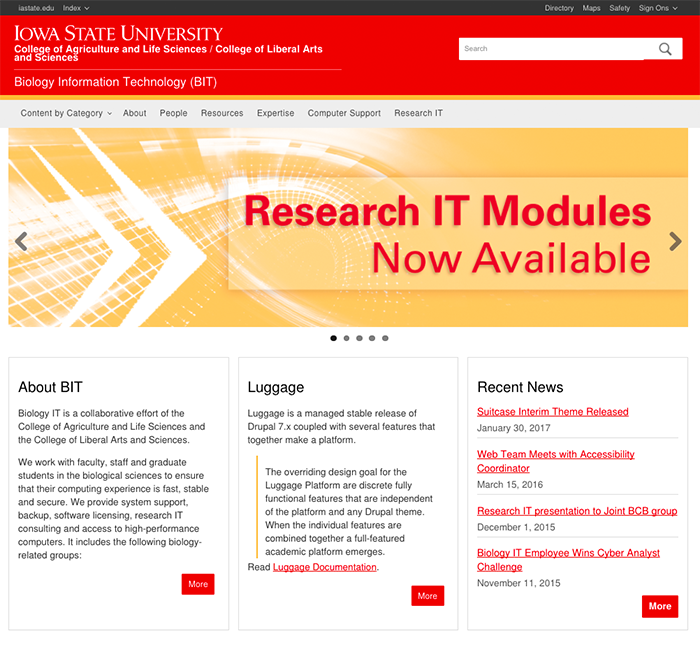
This layout features a full width announcement banner, and a row with three columns below.

This layout has a full width banner and multiple rows below. Rows can have between one and four columns.
Combine full width panel rows, rows of multiple small columns, and other column layouts.
It's easy to mix and match different panel sizes, and to create a full width call-to-action panel.

Add a row of 3 or 4 small panels (great for partner logos) to go with a hero banner and a 'grow' panel.

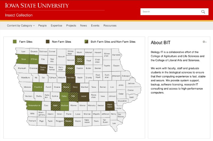
Allow for a large piece of functionality with extra details in the sidebar. (Interested in a mapping app? Just ask.)
